A complex buying process
ShutterLand was created to empower homeowners to select their own exterior shutters. Offering a user-friendly, online shopping experience was critical to achieving their mission. However, their existing site was difficult to navigate, and they risked losing buyers throughout the purchasing process.
At the time, Shutterland.com did not have visuals to guide users through the selection process. Homeowners would have to research options on other pages of the website or guess as to what might be best for their project. It also lacked explanations of the options, leaving site visitors confused when navigating industry jargon.
Along with missing information, making complex purchases was cumbersome. Users were asked to make multiple decisions, such as color, material, and sizing all at once. Additionally, there was no quick way to add multiple products with different specifications. Purchasing multiple shutters for windows of varying sizes was often frustrating.
Product builder improves buying experience
To improve the user-experience of the ShutterLand site, our team made several, impactful changes. The first was the use of a new icon system. Each offers a visual representation of common industry terms that are integral to ordering shutters. Having imagery tied to words, like top profile, divider rail, or louver, gives homeowners confidence when making their selections.
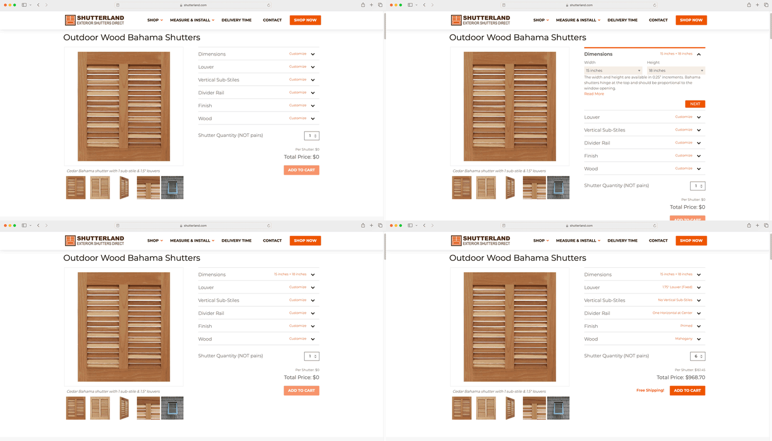
Another important change was adding accordions to the form. There are a number of choices users are required to make before ordering shutters. Having collapsible sections for each step makes the process more digestible.

We improved error reporting as well. This lets users know if the selections they are making are complete and possible. Allowing homeowners to fix issues as they go reduced customer service calls.
“It cut down on calls significantly. It lightened our workload and made it easier on the customer as well.” Brian Wright, Owner of ShutterLand
The final improvement was creating a persistent form. Now, it doesn’t refresh when users are adding items to their cart. With this change, they can place their product in the cart, make small changes, and then, add a modified version that meets the next set of specifications.
A better buying experience
With these improvements, ShutterLand has created a better buying experience for homeowners. The product builder is more intuitive with the addition of icons. Visitors can easily see stains, colors, and designs for each component, as they are customizing their order. Additionally, there are fewer choices for the user to make at once. Accordions make the lengthy decision-making process more digestible.
“This product builder’s ease of use made it simpler for the customer to get answers really quickly. As a result, our sales did increase.” Brian Wright, Owner of ShutterLand
One of the most impactful changes has been the persistent form. Visitors can quickly and easily add all the products they need to the cart, making modifications to each as they go. The new approach reduces frustration and keeps homeowners from abandoning their carts mid-sale.
