
The details of your website design speak volumes about your brand’s character and trustworthiness. We’re talking about your site’s User Interface, or UI for short, and getting this right will reinforce the right messages in the minds of your visitors. Especially if your site has been around for a while, creating a UI Inventory is a fantastic investment!
What is a UI Inventory?
A UI Inventory is a document with visual examples of all the form element styles (like buttons), text styles, and photo/illustration styles on your website.
Why create a UI Inventory?
The end goal is to increase confidence in your brand through consistent, usable, and beautiful design. When you pull together these design details into a single document, you’ll be able to take an objective look at where you stand today. And, you don’t have to be a designer to do it! A UI inventory will start you on the path towards improvement by helping you find inconsistencies, and by approaching the design of your site strategically.
How to create a UI Inventory
First, start with one type of element to assess, like buttons, and grow your inventory over time. It can feel overwhelming to think about taking account of every visual style on your site!
Otherwise, the process is simple:
- Visit every unique page / page template in your browser.
- Using a screenshot tool, capture images of each unique element. [On a mac, press ⌘ + Shift + 4. On Windows use the built-in Snipping Tool.]
- Compile all of these images into a single page, if possible, using a layout tool such as InDesign, KeyNote/Powerpoint, or Word.
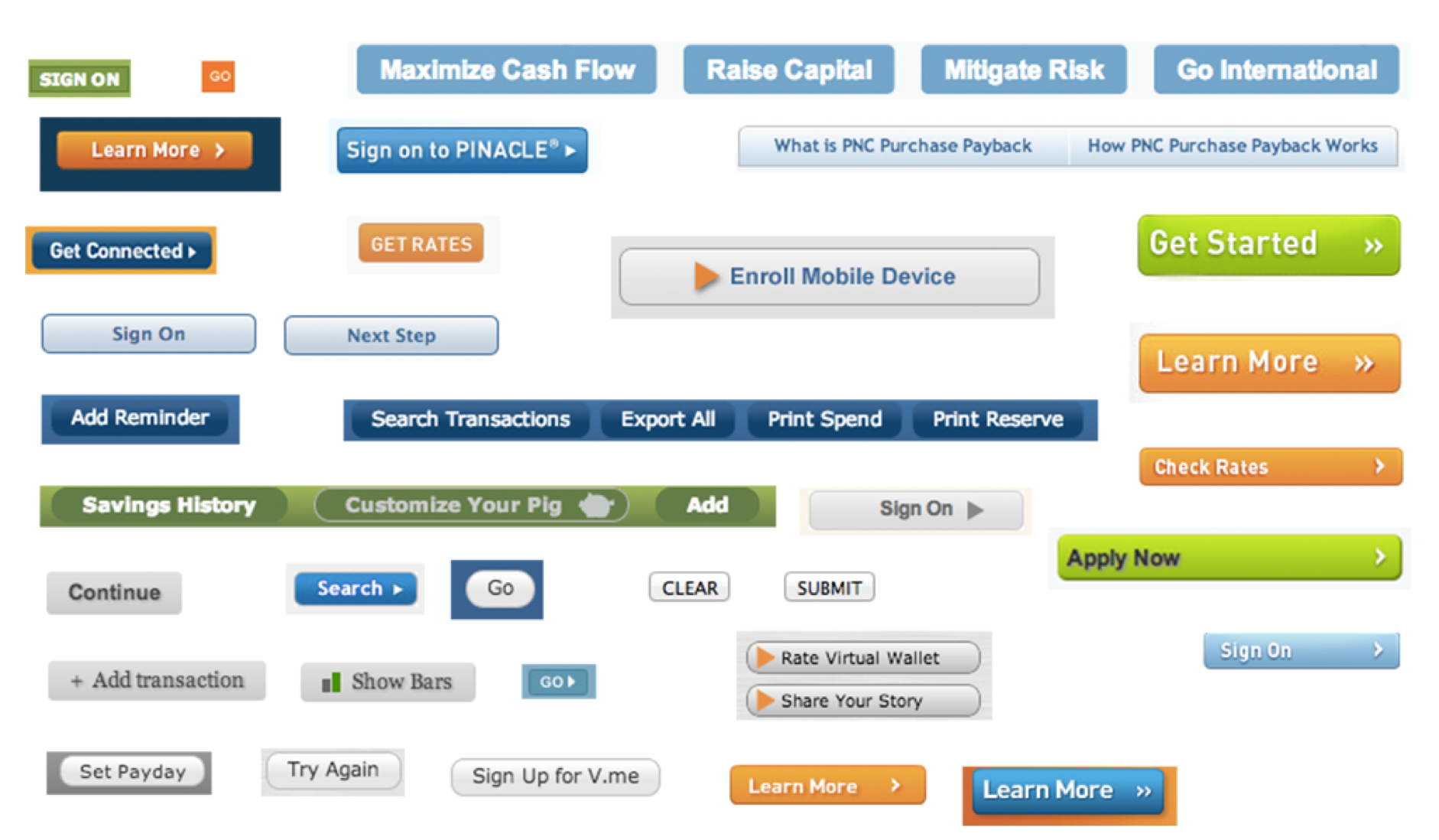
An example of what you might end up with when taking a button inventory. Source: Atomic Design by Brad Frost
Then what?
Of course, the inventory itself is only as powerful as the actions you take next. It’s crucial that you review the document with your team, and ask the right questions:
Are there design inconsistencies between the elements? Be ruthless about the details.
Is the overall look consistent with the rest of our marketing materials?
Do the elements communicate the right level of professionalism vs. playfulness?
If the element is interactive (like a button), is its function obvious? Do all the elements that look similar perform similar functions?
Does your site use various text styles in the same way? For example, heading levels, text links, italicized text, bolded text.
For photos and illustrations, are the color palettes reasonably consistent? Is the depth of field consistent?
In the places where you’ve identified issues, it’s time to get to work! While you may need a developer to help clean things up, some changes may be as simple as selecting the right styles through your CMS.
More resources
Web designer Brad Frost has developed a fantastic, in-depth approach towards this very topic, and we can’t recommend it enough. Read: The Atomic Workflow.