Whether you’re building a new website or maintaining the one you’ve already got, speaking the same language is key to efficiency. Here are three terms that tend to mean different things to different people. Let’s disambiguate!
Site Structure
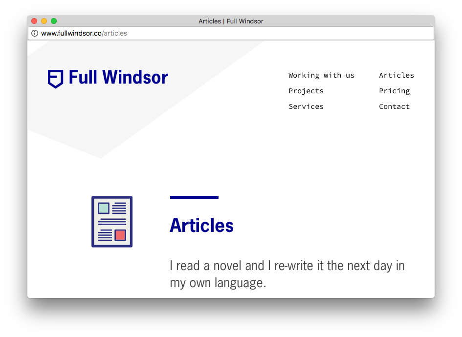
Here’s a term that has at least two definitions. In our office, when we say “site structure,” we’re usually talking about URL Structure. On the ground, this means the parent-child relationship between web pages, and it’s represented in your browser’s url bar right now: http://fullwindsor.co/articles/align-your-teams-website-lingo.
The second meaning of this term is Menu Structure. This refers to the user interface (UI) element on a website that folks can use to navigate through your site.
It’s important to note that a site’s Menu Structure often mirrors its URL Structure, but this isn’t always the case. When we’re building a new website, we always make a separate outline for each, so we can consider the best structure for each. A good Menu Structure is good for user experience; a good URL Structure is good for SEO and shareability.
Archive Page
We also like to call these Feeds or Aggregate Pages. These terms refer to a page with an automatically-generated list of content, usually grouped by category or date.
Think news page. Basically, an archive page contains content from other places on the same website. A common use case is a list of blog posts organized by category or date. This kind of page contrasts with those which only contain manually entered or static content.
Popup Window
Ah, the popup. This term has a lot of baggage because of past misuse by some web developers. But not all popups create a bad user experience, especially if they are employed in the right scenarios.
Popup 1: Modal / Light Windows

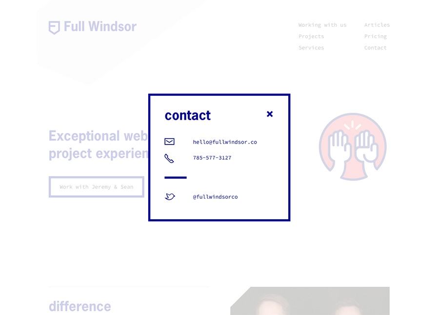
These are overlay boxes which force user interaction before the visitor can perform other tasks. The best use case here is a contact form (such as this one!). Light windows are our preferred type whenever possible, because they allow complete design customization.
Popup Type 2: Browser Alerts

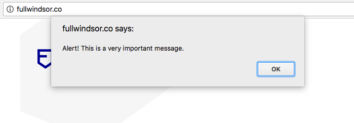
These are notification boxes that come directly from your browser (like Chrome or Firefox). It’s not possible to change the design here, but they are extremely intrusive, and thus appropriate in certain rare situations.
Popup Type 3: Brand-new Windows

These allow new content to be loaded on top of an existing page without forcing user interaction. These days, they’re fairly uncommon, but they do show up, especially for authentication interfaces.
A Word Of Advice
If you’re thinking about using a popup, simply consider whether or not the user would benefit from the interruption—or if it’s primarily self-serving. We’ve found this to be the most helpful rule of thumb in the debate!
Dig A Little Deeper
It’s a confusing world out there. Here are three additional web-terminology glossaries to take you even further on your journey—especially if you want to dive into some more technical lingo.
- Web Design Industry Jargon and Web Terms: Glossary and Resources (via Smashing Magazine)
- 25 Web Design and Development Terms Every Marketer Should Know (via Circle Studio)
- Web Nerd Terminology (Explained) (via CSS-Tricks)
