WordPress has one of the richest plugin ecosystems out there. Need a form builder, SEO tools, performance optimization, or custom functionality? There’s probably a plugin for it.
That flexibility is one of WordPress’s biggest strengths. But not all plugins are created equal, and a plugin isn’t the right solution for every problem. Some make your site easier to manage, faster, and more scalable. Others can quietly introduce complexity that only shows up when something breaks or needs to change.
So what actually makes a great plugin?
It’s Focused
A great plugin does one thing really well.
It’s tempting to reach for tools that promise to handle multiple needs at once, but that added scope often comes with added complexity. The more responsibilities a plugin takes on, the more likely it is to introduce conflicts, unexpected behavior, or difficult debugging scenarios.
Focused plugins are easier to understand, easier to test, and easier to replace if needed. They keep your site modular, which is exactly what you want as things evolve over time.
It Stays Behind the Scenes
In our experience, the best plugins are the ones you barely notice on the front end.
Plugins that handle behind-the-scenes functionality or live primarily in the WordPress admin tend to be more stable and easier to work with. Things like data management, custom fields, integrations, or workflow tools fall into this category.
Once a plugin starts controlling front-end layout or styling, things can get more complicated. That’s where you often run into overly aggressive CSS, conflicting styles, or markup that is hard to customize and keep accessible. Even small visual tweaks can turn into time-consuming work if you’re fighting against how a plugin outputs its code.
Keeping plugins focused on functionality rather than presentation helps maintain a cleaner separation between content, logic, and design. And that separation makes everything easier to manage.
It’s Well Maintained and Documented
Even a well-built plugin can become a problem if it’s not actively maintained.
A great plugin gets regular updates. That usually means bugs are being fixed, security issues are being addressed, and compatibility with newer versions of WordPress is being maintained.
Documentation matters too. When something doesn’t work the way you expect, clear docs save a lot of time. They help you understand how the plugin is intended to be used and what options you have for extending or customizing it.
Choosing Plugins With the Long Term in Mind
The best plugins are focused, stay out of the way of your front-end design, and are actively maintained with solid documentation. These are the keys to an extensible, secure site that works for everyone.
If you’re unsure about a plugin, dealing with a frustrating issue, or just want a second opinion before moving forward, we’re happy to help.
Search is changing in a big way. More and more, people aren’t scrolling through pages of links—they’re asking tools like ChatGPT or Claude a question and getting a single, stitched-together answer. That shift raises a simple but important question: if your website isn’t the thing people are clicking anymore, what does it mean to be visible online?
We asked our good friend and go-to SEO expert Josiah Casey how that new reality is playing out. We talk about what it actually means to show up in an AI-generated answer, why some brands get mentioned while others don’t, and what you can realistically do to improve your chances. Along the way, we get into the kinds of content that seem to resonate, how authority works when algorithms are doing the summarizing, and how to tell if any of it is paying off.
Is it as valuable to show up as a source in an AI-generated answer as it is to show up on a traditional search engine results page (SERP)?
Showing up in an AI-generated answer is at least as valuable as a standard organic search result today, and in some cases more so. Modern search results pages are so cluttered with ads, shopping features, and AI overviews that traditional organic listings are already getting pushed down. If someone is using a chat platform like ChatGPT or Claude, your Google rankings are irrelevant to them entirely.
That said, not all AI mentions are equal. Being listed alongside competitors as one option in a category is decent visibility, but being the recommended answer is a different level entirely. That kind of citation carries real weight, and the conversion data backs it up: traffic coming from AI tends to close at a higher rate, likely because those visitors have already done most of their research before they ever click through.
What practical steps can businesses take today to increase their chances of being cited by AI tools?
Start with an entity audit: make sure AI systems actually know who you are. That means a complete Google Business Profile and consistent name, address, and phone number across major directories. From there, identify the specific prompts you’d want to be cited for and go test them.
Most AI tools that pull live data are searching Google and scraping the top results, so if you show up in those organic results, you’re more likely to appear in the AI’s answer. That makes traditional SEO the most practical lever you have, just pointed at the right queries.
Are there specific types of content that perform better in AI-driven search?
Specific, detailed content tends to outperform broad topic coverage. FAQs, comparison guides, and best-of lists do particularly well, likely because they map directly to the kinds of questions people ask AI tools. Strong opinions from a credible source also seem to get picked up more than hedged, try-to-please-everyone content. The pattern is that AI tools favor content that resolves a specific question over content that simply addresses a topic.
How important are brand authority and backlinks for appearing in AI-generated answers?
Brand authority and backlinks both matter, but not necessarily in the way you’d expect.
Large Language Models (LLMs) appear to determine brand authority largely through citation frequency: how often your brand is mentioned across the sources they were trained on and actively retrieve from. Backlinks don’t seem to be a direct input, but they influence your Google rankings, and since many AI tools are actively searching Google and pulling from those results, ranking well still feeds into whether you get cited.
There’s also a source credibility layer worth paying attention to: AI tools tend to favor certain publications and websites when answering questions in a given category. Identifying which sources AI consistently cites in your industry, and working to get mentioned there, is probably more useful than chasing traditional link metrics.
How can we tell whether our content is being used by AI systems like ChatGPT or Google Gemini?
The most direct signal is your analytics: if an AI tool cited you and the user clicked through, you’ll sometimes see referral traffic from platforms like ChatGPT or Gemini. It’s incomplete data because attribution is increasingly unreliable, and not every AI link passes referral information, but it’s the closest thing to ground truth you have.
Beyond that, most people turn to prompt tracking, which has its own limitations. We don’t have access to what people are actually prompting these systems with, so identifying the right prompts to monitor is largely guesswork. The workaround is to run high-volume sampling on your best guesses and look for frequency patterns over time rather than trying to read any single result.
Josiah Casey is the owner of KC Visibility, a Kansas City-area SEO agency focused on helping businesses grow organic search revenue.
If you run a website, keeping your site secure should be near the top of your list. It means keeping your site online, protecting it from tampering, and preventing hackers from gaining access to sensitive data. When your site goes down, campaigns stall. When pages get defaced, brand trust takes a hit. When data is exposed, the consequences can be serious.
If you run your site on WordPress, the stakes are even higher. Since WordPress powers about 43 percent of the internet, these sites face around 90,000 attacks per minute. These come from automated bots scanning for low-hanging fruit like outdated plugins or known vulnerabilities.
The good news is: You are not powerless! Firewalls, strong authentication, backups, and access controls all help reduce risk. And because plugins are such a big part of the WordPress ecosystem, a vulnerability monitoring platform like Patchstack, Wordfence, or WPScan is essential. It is not the only layer you need, but it is a critical one that gives you visibility into what is actually happening under the hood.
What Is a Vulnerability Monitoring Solution?
A vulnerability monitoring solution continuously scans your site and compares it against a database of known security issues. Think of it as an early warning system for your tech stack. It scans your site looking for known vulnerabilities in installed plugins, themes, and core files. It checks version numbers and code signatures against an up-to-date vulnerability database. If a specific plugin version has a vulnerability, you’ll know about it quickly.
It also looks for signs of trouble that may already exist. This can include suspicious file changes, injected scripts, modified core files, or unusual database activity. They also identify abandoned plugins and themes, or opportunities to update your software stack. Catching these early can save you from a much bigger cleanup later.
Most importantly, a good solution adds context. It does not just throw a technical warning at you. It explains how serious the issue is, whether it is actively being exploited, and what steps you should take. For busy marketing and web teams, that clarity is incredibly helpful.
How Is a Vulnerability Monitoring Solution Implemented?
Implementation is usually straightforward. In most cases, you install a plugin or connect your site to a cloud based dashboard. For WordPress, this often means adding a lightweight agent that communicates with the provider’s vulnerability database.
From there, you configure scan frequency, notification settings, and user access. Alerts can be sent via email, Slack, or even pushed into your ticketing system. This is especially useful if you manage multiple sites or work within a structured workflow.
Allowing You to Rest Easy
A vulnerability intelligence solution gives you clear visibility into the weak points attackers are actively looking for, and it helps you prioritize, patch, and protect your site before minor issues turn into major problems.
Some fixes may require help from a developer, especially if updates create conflicts or involve custom code. If you need a hand evaluating risks or implementing patches, we are here to help!
Forms are one of the most important touchpoints on your website. Whether you’re collecting leads, processing orders, or gathering feedback, forms act as the bridge between your audience and your business. Yet a lot of web site managers overlook one crucial element: form validation. When done well, form validation protects your site, improves data quality, supports accessibility, and creates a smoother user experience for everyone.
What Is Form Validation?
Form validation is the process of checking whether the information a user enters into a form is complete, accurate, and formatted correctly before it’s processed or stored. This might include ensuring required fields aren’t left blank, email addresses follow the correct format, or phone numbers only contain valid characters. It also includes making sure hackers aren’t using your forms as an entry point for attack.
Validation can happen in two places: on the client side (in the browser, often using JavaScript or HTML attributes) and on the server side (after the form is submitted and reaches your server). Both play an important role in making forms effective and secure.
Why Does It Matter?
For Security
From a security standpoint, form validation is essential. Client-side validation provides immediate feedback and helps catch simple errors early, but it should never be your only line of defense. Malicious users can bypass browser-based checks entirely.
That’s why server-side validation is critical. It ensures that all incoming data is verified before being saved, processed, or used in your systems. Together, client-side and server-side validation help protect against common threats like SQL injection, spam submissions, and malformed data that could clutter up or compromise your website.
To Gather Clean, Usable Data
For marketers and website managers, data quality is everything. Poorly validated forms lead to messy datasets—misspelled email addresses, inconsistent formats, and incomplete records. This makes it harder to segment audiences, run campaigns, or analyze performance.
Strong validation rules help ensure that the data you collect is clean, consistent, and easy to access or manipulate across platforms like CRMs, email marketing tools, and analytics software. The result is better insights, more effective campaigns, and less time spent cleaning up bad data.
For Accessibility
Accessible form validation is a critical part of building inclusive digital experiences. Clear, specific error messages help users understand exactly what went wrong and how to fix it. Instead of vague messages like “Invalid input,” users should be told exactly which field needs attention and why.
This is especially important for people using screen readers or other assistive technologies. When forms are properly labeled and error messages are programmatically associated with the relevant fields, users can navigate and complete forms more easily and independently.
The World Wide Web Consortium (W3C) provides detailed accessibility guidelines through the Web Content Accessibility Guidelines (WCAG), which include best practices for form validation, error identification, and user feedback. Following these standards not only supports users with disabilities but also reduces legal risks.
For a Better User Experience
Good form validation improves the experience for everyone. Instant feedback reduces frustration, prevents unnecessary page reloads, and helps users complete forms quickly and confidently. When errors are easy to understand and correct, users are less likely to abandon the form altogether.
In short, better forms mean higher conversion rates, fewer support requests, and a more professional brand impression.
Next Steps for Smarter Forms
For marketers and website managers, investing in well-designed, accessible forms pays off in better results and happier users. Setting them up often requires the help of a skilled web developer who understands validation, accessibility standards, and secure data handling. If you need help building or improving your forms, reach out—we’d be happy to help you get it right.
If you manage a website, chances are you’re juggling content updates, SEO tasks, and maybe a few plugin emergencies. Accessibility might feel like “one more thing,” but it’s actually a foundational part of running a successful site. And you don’t have to be a developer to understand the basics or make meaningful improvements. Let’s dive in to learn the basics!
Why Is Website Accessibility Important?
Better UX
At Full Windsor, we like to say that “Websites are for people” — and this is why we care about accessibility. At its core, accessibility is about creating a better user experience.
Many visitors rely on assistive technologies like screen readers, alternative input devices, and Braille displays, to navigate your site. If your site isn’t structured with these tools in mind, you’re probably unintentionally locking people out. Accessible sites ensure everyone, regardless of ability, can read and interact with your content.
But accessibility doesn’t just benefit people with disabilities. Websites built with clear structure, good contrast, descriptive links, and intuitive navigation are easier for all visitors to understand and use. And accessible sites often perform better, too. Clean markup, logical structure, and semantic content tend to improve load times and reduce user friction. We love a win-win!
Legal compliance
Depending on your region and industry, you may be legally required to provide accessible digital experiences. Accessibility lawsuits have been steadily rising, and many businesses now prioritize compliance to manage risk. While the legal landscape varies, following recognized accessibility guidelines is undoubtedly a smart move.
Better SEO
Search engines like Google reward websites that follow accessibility best practices. Proper headings, alt text, and semantic structure help search crawlers understand your content, and that leads to higher rankings.
What Does It Mean to Have an Accessible Website?
Follow WCAG principles
The Web Content Accessibility Guidelines (WCAG) offer a global standard for accessibility. At a high level, these boil down to four principles:
- Perceivable: People can perceive your content in some way.
- Operable: Users can interact with your content, no matter how they navigate.
- Understandable: Content is clear and predictable.
- Robust: Content works with current and future technologies.
Look for these common accessibility features
Just a few of the most common (and impactful) indicators include:
- Alt text for images
- Keyboard navigation and Screen reader support
- Sufficient contrast ratios between text and background
- Accessible forms including clear labels and helpful validation messages
How Can I Tell If My Website Is Accessible?
Manual testing is the gold standard. Actually navigating your site with only a keyboard or using a screen reader can reveal issues automated tools miss. That said, tools like Lighthouse (built into Chrome DevTools) and WAVE (a browser extension) can quickly surface common problems and give you a sense of your baseline accessibility health.
How Do I Make My Website More Accessible?
Not through overlays or AI tools
Accessibility overlays or automated “AI accessibility” solutions often promise instant compliance, but they rarely deliver meaningful results. Actually, they can often even introduce new problems. True accessibility comes from structured content and accessible code.
By making code-based improvements
The deepest and most effective fixes will need a developer’s touch.
- Ensuring all UI elements are keyboard navigable
- Adding or adjusting ARIA attributes for assistive technologies
- Maintaining proper focus order and visible focus indicators
- Making sure content reflows correctly when zoomed in
But, some DIY improvements are possible (depending on your CMS)
You can often make improvements directly in your website editor. Here are a handful of improvements you may be able to tackle right away.
- Use sequential headings (e.g. don’t skip heading levels from
<h2>to<h4>) to create a logical content hierarchy - Add alt text when images convey meaning (not for purely decorative images, though!)
- Write clear link text (e.g. “Read our refund policy,” not “Click here”)
- Ensure adequate color contrast
- Provide helpful form validation messages
- Avoid using identical link text that leads to different destinations
Building a More Inclusive Web
Website accessibility is about creating a more inclusive, more usable, and more resilient experience for every visitor. If you’re ready to join us on our mission to make the web a friendlier place, let’s talk.
Imagine waking up to find your website offline. Maybe a plugin update broke something, or a hacker slipped in overnight. How fast could you get things back to normal?
The answer often comes down to one thing: your website backup system.
Whether your backups come from your web host or a third-party service, it’s worth making sure they’re truly doing the job. Here’s what to look for when evaluating your current setup or shopping for something better.
1. Backups Stored Somewhere Else
One of the biggest mistakes organizations make is storing backups on the same server as the live site. If that server goes down or gets compromised, you lose both your site and your backup.
A solid backup system stores your files somewhere completely separate — ideally off-site or with a separate cloud service. This way, if your hosting server ever crashes or gets compromised, your backups are still safe and sound in another location. Redundancy is your friend.
2. Daily Backups That Go Back at Least 30 Days
Websites change all the time: new blog posts, form submissions, online orders, edits from your team. A daily backup schedule is the minimum backup frequency you should accept.
But daily alone isn’t enough! You also want retention. Keeping at least 30 days of backups gives you breathing room. Maybe you discover an issue that started a week ago, or you need to roll back before a redesign. Having a month’s worth of versions means you’re covered no matter what.
3. A Safe Way to Test Restores
Here’s a scary truth: a lot of people never test their backups until disaster strikes.
A trustworthy system lets you restore to a staging or development environment first, so you can confirm everything works before touching your live site. This step takes the guesswork out of recovery and helps you avoid nasty surprises.
If your host offers a staging area, use it. If not, see if your backup provider lets you restore locally. Either way, don’t skip the test run.
4. One-Click Restores
When something breaks, you want your site back fast. Look for backup tools that make restoration simple. This is useful not just for disaster scenarios. Your developer will thank you for making environment transfers (think Staging → Production deployments) a cinch.
5. Downloadable Backup Points
Sometimes you (or your developer) will want your own offline copy, maybe for testing, archiving, or compliance reasons. A good system lets you download specific backup points whenever you want.
6. Granular Restore Options
Not every problem requires a full restore. The best backup systems let you choose what to bring back: just the database, just your media files, or the whole thing. That flexibility saves time and reduces the risk of overwriting perfectly good content.
Final Thoughts
For website managers and developers alike, having reliable backups is both an invaluable safety net and a massive time-saving tool.
If your current setup doesn’t check all these boxes, it may be time to upgrade — because when disaster strikes, the only backup that matters is the one that actually works.
Images are the lifeblood of most modern websites. They grab attention, communicate brand personality, and keep visitors engaged. But they also tend to be the heaviest assets on a page, which means they can have a big impact on load times and performance. The good news is image compression has come a long way since the early days of the web, and there are some new options that can make a serious impact on your site’s speed, SEO, and conversion rates.
So, let’s dig into what you should know about next-gen image file types, and how they compare to the classics.
What to Consider When Choosing an Image File Format
Not all image formats are created equal. Before you decide which one to use, weigh these factors:
- Performance / Speed Smaller file sizes mean faster page loads, which means happier users (and better SEO rankings).
- Quality / Aesthetics Compression shouldn’t destroy your visuals. Crisp, high-quality images are especially important for products, photography, and brand identity.
- Browser Compatibility Even the sleekest new format won’t help if your users’ browsers don’t support it. Always check compatibility before rolling out a new standard across your site.
Next-gen Image File Formats
Most of us are familiar with the “big four”: GIF, PNG, JPG, and SVG. These formats aren’t going anywhere anytime soon. PNGs and JPGs still make sense in plenty of cases, and SVGs are unbeatable for logos and icons since they scale without losing sharpness. Even GIFs occasionally have their place for simple animations (though less so today).
But there’s a new wave of formats designed for the modern web: WebP, AVIF, and JPEG XL.
WebP
Developed by Google, WebP is widely supported across browsers and can make your images 25–34% smaller than JPEGs at the same quality.

Example of WebP image compression. Source: https://developers.google.com/speed/webp/gallery1
When to use it: If you’re only going to adopt one next-gen format, start here. It usually makes sense to use it over JPEG and PNG when AVIF isn’t an option.
AVIF
AVIF supports transparency and even animations, while delivering amazing compression. File sizes can be 50% smaller than JPEG and 20-30% smaller than WebP.
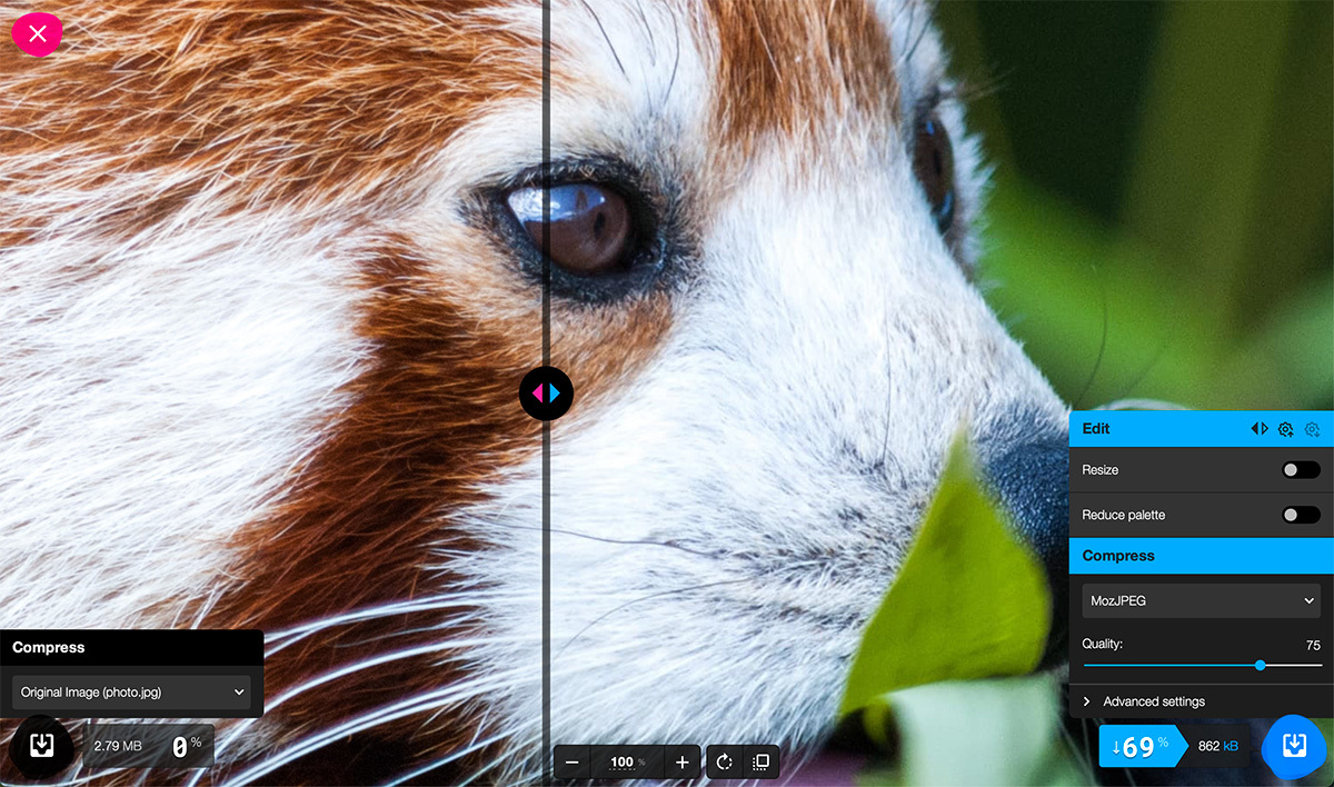
Example of AVIF image compression. Source: https://squoosh.app
When to use it: If you are willing to manually convert your images, this is almost always a better choice over JPEG, and sometimes over PNG (we recommend testing for this).
JPEG XL
JPEG XL is a newer format designed to replace JPEG, and has even better compression than AVIF.
When to use it: Honestly, don’t. As of now, browser support is minimal and development momentum has slowed (Chrome has already removed support for it). Unless things change, it’s sadly not worth investing in.
Want to dig deeper? Check out the MDN guide to all image file formats.
How to Convert to Next-gen Image File Formats
Converting your images doesn’t have to be a hassle. Here are your options:
- Cloudflare Polish: Our preferred method. It automatically converts images on the fly and compares the original vs. optimized version to ensure you always deliver the best-performing option. No manual work required.
- WordPress Plugins: Plugins from ShortPixel or Imagify can automatically convert and optimize your images for you.
- Manually: Use software like Photoshop or free online converters to save images as WebP or AVIF. This gives you control but can be time-consuming if you have a lot of images.
Conclusion
File formats are just one piece of the performance puzzle. Other techniques like lazy-loading, responsive image sizing, and a solid CDN setup can make just as much of a difference. If you’re not sure which format to go with, try testing your site using Lighthouse or DebugBear. And if you’d rather not stress about it, we’re always here to help you figure out the best approach for your site.
If you’ve ever published a new blog post, updated a headline, or swapped an image on your website—only to find that visitors still see the “old” version—you’ve experienced caching in action.
Caching is one of the key technologies that makes websites fast, reliable, and scalable. But while it’s great for performance, it can sometimes be frustrating if you don’t understand how it works. In this post, we’ll break down the different types of caching, and why they matter not just for developers, but also for anyone who manages a website.
What is Website Caching?
In simple terms, caching is the process of storing a “copy” of something so it can be delivered faster the next time. This can happen at multiple levels and in multiple ways.
When visitors access your site without caching, they are getting things in the slowest way possible.
With caching in place, visitors receive a significantly-optimized version of your website. Only the necessary components are generated, downloaded, and served from the closest servers.
The Main Types of Website Caching
Browser Caching
With browser caching, when someone visits your website, their browser saves the code (think HTML and CSS) and files (think images and videos) locally on their device. On the next visit, the browser doesn’t need to re-download these files, because it already has them!
Keep in mind: If you replace an image or update design elements, some visitors may not see the change right away due to—you guessed it—browser caching. Though visitors can get around this by performing a hard refresh, you can also configure your site to “break” their cache when you need to.
Page Caching
Page caching saves a full version of a page on the server, so it doesn’t need to be rebuilt from scratch every time someone loads it. This is important for websites built on content management systems (CMSs, like WordPress) that rely on databases and dynamic code.
If you’re a content manager, you should know that if you publish new content on a site with page caching, visitors may continue to see the older cached page until the cache refreshes or is manually cleared.
Object Caching
On sites with a CMS, content is stored in a server database, and accessing this content means lots of repetitive database queries. Object caching stores the results of these queries so they don’t need to be recalculated constantly.
If your site has complex features—like product catalogs, search tools, or membership dashboards—changes to this data might not appear instantly if the object cache is serving an older result.
CDN (Content Delivery Network) Caching
A CDN is a network of servers around the world that stores cached versions of your website’s files. Visitors automatically load content from the server nearest to them, which makes everything faster!
Just remember that if your site has an audience that is spread out geographically, updates may appear at different times depending on where users are located. A new article might show up in Europe before it does in the US, depending on how the CDN refreshes its cache.
How to Manage Content with Caching in Mind
We all know that caching can cause frustration when it’s not configured correctly. But it is meant to be a feature, not a bug!
Now that you understand the different types of caching, here are four quick tips for making it play nice with your workflow:
- Use your CMS or hosting platform’s “clear cache” feature after publishing major updates.
- If possible, set caching rules so that frequently updated sections (like news feeds or product pages) refresh more often than static sections (like your About page).
- Coordinate with developers or your hosting provider if caching issues persist, especially with CDN or server-level caches.
- If you’re not seeing what you expect after an update, test your changes using a private browser window or “hard refresh” to bypass the browser cache.
Caching: Not just for nerds
Caching isn’t just for developers. It’s something every content manager should have on their radar. While it may seem like a technical detail, it directly affects how your content appears to the world. By understanding the different types of caching, you’ll be better equipped to manage updates, troubleshoot “stale” content issues, and keep your website both fast and fresh. 😎
Need help understanding or setting up your website cache?
As a growing development studio, our projects thrive on organization, efficiency, and adaptability. Over the years, we’ve tested countless project management tools, but ClickUp has to be the best we’ve found to date, not just as a task manager, but as the operational backbone of our business. Here’s why we love it.
1. Endless Customization for Scaling
We’re big believers in building systems that help us scale, and ClickUp’s customization capabilities make that possible. From custom fields that let us track anything from deployment strategies to time spent on a task, to a wide variety of views—List View for clear to-do breakdowns, Dashboard views for high-level overviews, and Gantt View for scheduling—ClickUp adapts to the way we work.
2. API Integration That Supercharges Our Workflow
ClickUp’s API has been a game-changer for our internal processes. We’ve used it to pull data in and out of ClickUp, syncing it with our time tracking in Harvest. This ensures our billing stays precise and tied directly to task completion. It also allows us to integrate with our clients’ preferred project management tools, like Asana, without anyone needing to change their workflow. The result? Less manual data entry, fewer errors, and a seamless flow of information between platforms.
3. Transparent Collaboration with Clients
Transparency is at the core of how we work. ClickUp makes it easy to share project spaces directly with clients, giving them visibility into progress, timelines, and deliverables. This cuts down on endless status update emails and helps clients feel more engaged in the development process.
4. A Living Knowledge Base for Our Team
ClickUp isn’t just where tasks live. It’s also our central knowledge base. We use its Docs feature to store our SOPs (Standard Operating Procedures), ensuring that everyone on the team has access to up-to-date processes. Whenever we refine a workflow or discover a new best practice, we document it directly in ClickUp. This helps onboard new team members quickly and keeps institutional knowledge from getting lost.
5. A CRM That Keeps Our Sales Pipeline Organized
One of the most surprising ways ClickUp has helped us is as a CRM. By customizing fields and views, we track leads as they move through our sales funnel, from initial contact to signed contract. This means no lead slips through the cracks, and everyone knows the status of every potential client.
In short, ClickUp has become a flexible, integrated system that supports every aspect of our agency’s operations. From streamlining internal workflows to improving client communication, it’s become an essential part of how we deliver high-quality web development work at scale.
Your website is often the first interaction potential customers have with your brand. As user behavior and expectations evolve, it’s important to regularly evaluate and update your site to ensure it meets their needs. However, redesigning a website isn’t just about aesthetics—it should be a strategic decision driven by data and analytics. This article will walk you through how to leverage data to create an effective website redesign strategy that improves both user experience and business outcomes.
Set Clear Goals Ahead of Time
Before diving into your analytics, it’s essential to define what you want to achieve with your redesign. Is your goal to improve user engagement, boost conversion rates, increase mobile responsiveness, or enhance SEO? Setting specific, measurable goals will give you a framework for evaluating your website’s current performance and help you identify the right metrics to focus on.
For example, if your goal is to increase conversions, metrics like bounce rate, conversion rate, and user flow will be key. If the focus is on SEO, then tracking organic search traffic, page load speed, and time on page will be critical. Establishing these goals upfront ensures that your data collection and analysis remain focused and actionable.
Analyze Website Traffic and User Behavior
Your website analytics are a goldmine of information that can reveal how visitors interact with your site. Google Analytics and other web analytics tools provide insights such as:
- Page Views: Understand which pages are the most visited and which ones users tend to ignore. High traffic pages might need only minor updates, while less popular pages may require a complete overhaul or removal.
- Bounce Rate and Time on Page: A high bounce rate indicates that users are leaving your site without interacting, suggesting issues with content relevance or user experience. Time on page can tell you whether visitors find your content engaging.
- Conversion Funnel: Examine the user flow from landing pages to conversions. Where are users dropping off? Identifying bottlenecks in your conversion funnel can help you prioritize redesign efforts on critical pages.
- Mobile vs. Desktop Traffic: With mobile traffic surpassing desktop, ensuring a mobile-optimized experience is no longer optional. Analytics can help you see if there are significant discrepancies between mobile and desktop performance, signaling the need for a mobile-first redesign approach.
Conduct Heatmap and User Testing
While traffic data is essential, understanding how users navigate your website requires more in-depth tools. Heatmaps, provided by platforms like Hotjar or Crazy Egg, give you a visual representation of where users are clicking and scrolling on your site.
Heatmaps can reveal:
- Click Hotspots: See which elements attract the most user attention. If key CTAs (call-to-action buttons) are being overlooked, their placement or design may need improvement.
- Scrolling Behavior: Are users scrolling through the entire page or stopping after the first few sections? This can indicate whether your content is engaging or needs better structuring to keep users scrolling.
Additionally, conducting user testing is a great way to get qualitative feedback. Ask real users to complete tasks on your current website and observe their frustrations or confusion. Their feedback can be invaluable in shaping your redesign priorities.
Monitor SEO Metrics
SEO should be a key consideration in any website redesign. A significant drop in organic traffic post-redesign can hurt your business. That’s why monitoring SEO metrics before, during, and after the redesign process is crucial.
Key SEO metrics to track include:
- Keyword Rankings: Ensure that high-performing keywords are not disrupted during the redesign. You may need to adjust content structure or meta tags to maintain or improve your rankings.
- Page Load Speed: Page speed is a direct ranking factor for Google. Use tools like Google PageSpeed Insights to identify slow-loading pages and improve them in your redesign.
- Backlinks: Be mindful of your site’s URL structure. A complete overhaul could lead to broken links, which hurt your SEO. Make sure to set up 301 redirects for any changed URLs to preserve your link equity.
Continuous Improvement Post-Launch
Your website redesign doesn’t end when the new site goes live. Post-launch, monitor key performance indicators (KPIs) like traffic, conversions, and bounce rates to see if the redesign has met your initial goals. Use A/B testing to continually refine elements like CTAs, images, or page layouts based on real-time user behavior.
Data-driven website redesigns are iterative, not one-off projects. By continuously reviewing your data and optimizing based on insights, you ensure your site evolves with changing user needs and market trends.
Conclusion
Redesigning your website can feel overwhelming, but by using data and analytics, you can make informed decisions that align with your business goals. From understanding user behavior to optimizing SEO performance, leveraging the right tools and metrics ensures your redesign will not only look great but also drive better outcomes for your business. Let data be your guide, and you’ll create a site that both your users and search engines will love.
Copyright © 2026 Full Windsor LLC. All rights reserved. Privacy Policy